Tuesday, 12 May 2015
Evaluation Question 3
During the research and planning stages, I used surveymonkey.com to conduct audience research.
First of all I asked for the ages of the respondents. The main target audience for music videos is teenagers, as they are the main consumers, therefore I naturally wanted to know want they like to see in a music video. I also asked about their music tastes. This way I could ensure that I was appealing to the right demographic; people who like rap music want different things from a music video than those who like indie rock. I also asked if there were any music videos they had seen recently that they thought were memorable, and why they thought so. This was to identify what makes people remember a music video, which is important as the purpose is to sell a song; if the video is memorable then by de facto the song is too.
However, this form of research was unsuccessful because I only managed to gather 17 responses. Only two of these were highly relevant responses as they stated that Red Hot Chili Peppers were one of their favourite bands but they didn't give much information in response to the other questions.


The rest of the respondents mostly liked pop music, however not many of the respondents gave relevant information regarding their tastes either.
In conclusion, I didn't learn a great deal from this part of my research. Therefore, I went ahead with my original idea.
However, I did consistently gather feedback from peers, family and teachers throughout the making of my products. For example, I asked my classmates what they thought about the part of the video where the girl(s) run down the hill. Because I'd watched it over again so many times, I couldn't decide how realistic it looked. They said that the editing was slightly out of sync, and that the transition needed to be smoother. So, I went back to it the next day and edited it to make it look more realistic, using a different transition and adjusting the timings. This feedback helped me to improve my video and make it more professional looking.
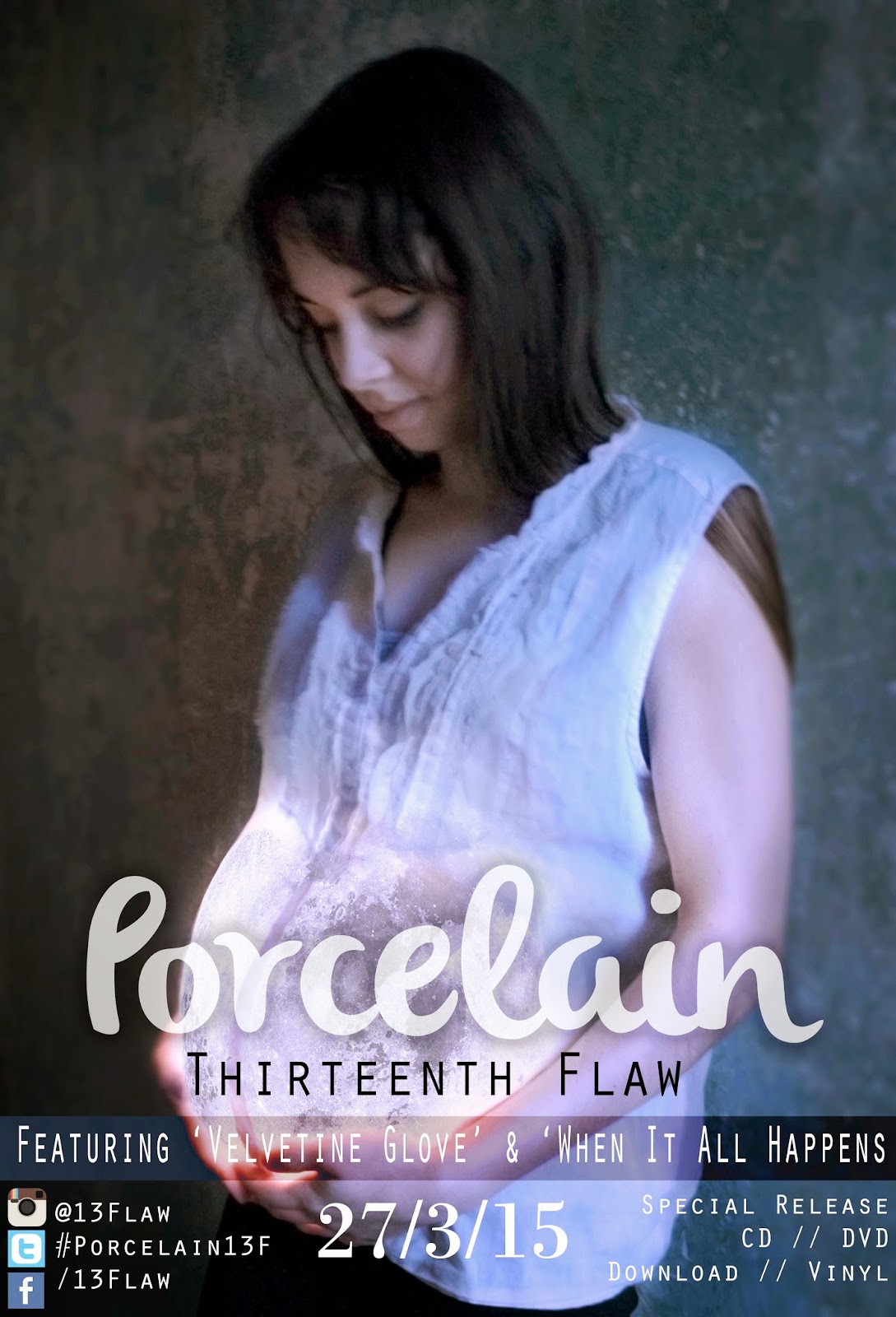
I also asked for a lot of feedback in the making of my ancillary texts. For instance, I had trouble making the pregnant bump on my magazine advert look like a moon, because the lights I had used were so yellow. I made many drafts of this image, editing it in different ways and asking people if they could tell what it was supposed to represent.


For the most part, people couldn't. Some people guessed it was meant to be a planet, but some couldn't tell what it was meant to be at all. Once I'd told them that it was supposed to be the moon, I asked them what I needed to do to make it look more convincing. Eventually I managed to edit the image perfectly so that most people who I asked knew what it was supposed to be.

As you can see I gave it a more 'glowing' look, adjusted the colour balance, and blended the edge of the 'moon' with the top more seamlessly.
I also asked for feedback from my peers and teachers regarding my font use on my magazine advert. Originally I had used more fonts, but decided to act on feedback and use just three fonts instead.
Once I had uploaded my video to YouTube, I shared the link to Facebook and Twitter, in order to receive further feedback. The video received 20 likes on Facebook, and several comments
Facebook: "10/10" "a mother's worse nightmare, but very nicely done! Felicidades!" "Haunting yet inspiring adaptation" "amazing"
Twitter: "I'm proud of you! Good choice of actress to use as well, she really sells it!" "This is so good"
Some criticisms were that the narrative was a little bit unclear at times, a few people didn't fully understand it. However most people understood the message, so I feel like I was quite successful in making the meaning and narrative understandable.
Sunday, 12 April 2015
Evaluation Question 2
How effective is the combination of your main product and ancillary texts?

This is for two reasons; the stand-alone imagery in the beginning and end parts of the video are more representative and symbolic of the meaning within the song that I was trying to portray. Therefore, these parts of the video sell the image attached to the meaning of the song rather than the actual narrative itself, and when marketing a song, a memorable image is important. The second reason is that there needed to be an air of mystery surrounding the ancillary texts in order to attract the audience into consuming the product. Because the imagery that I have included only reveals part of the meaning and the narrative, it sells the song just enough for the audience to be engaged with the message but still be intrigued enough to want to buy the product.
To summarise, I have embraced the strong imagery within the music video, evoked by the song's lyrics to create the ancillary texts which come together as a promotional package. The image of the pregnant woman is a very emotive image and
To make this analysis easier I have created a mood-board of my ancillary texts and stills from my main product. This way I can compare the similarities between the two and assess the strength of the three as a promotional package.
Consistencies/Similarities
- I have used the same font for the word 'Porcelain' wherever it is shown; the intro screen in the main product, on the magazine advert, on the CD cover and on the disks themselves. I have used a unique and memorable font which essentially creates a unique and memorable image.
- Consistent reference in imagery to the moon with the moon stomach in the video and imagery on the ancillary texts. This striking and intriguing imagery would attract an audience towards the magazine advert, CD cover and create enough interest for the audience to want to watch the video which is promoting the song.
- Consistent imagery of the character cradling her pregnancy bump, which again sells a strong, emotive image to the audience and attracts them to consume the product. It also places more emphasis on the narrative and the meaning of the song. If I'd used images of the band in the ancillary texts, the connection between the music video, the song meaning and the narrative would not be as strong.
- Some of the shots in the music video are almost identical to those in the ancillary texts; the locket in the hand, the blood on the bed, the shattered porcelain figures. This symbolic imagery brings all the products together, making the song more memorable.
- The contrasting light and dark shots within the music video are presented in the ancillary texts, again creating a strong image.
- Consistent use of split toning effect throughout the ancillary texts and the main product.
This is for two reasons; the stand-alone imagery in the beginning and end parts of the video are more representative and symbolic of the meaning within the song that I was trying to portray. Therefore, these parts of the video sell the image attached to the meaning of the song rather than the actual narrative itself, and when marketing a song, a memorable image is important. The second reason is that there needed to be an air of mystery surrounding the ancillary texts in order to attract the audience into consuming the product. Because the imagery that I have included only reveals part of the meaning and the narrative, it sells the song just enough for the audience to be engaged with the message but still be intrigued enough to want to buy the product.
To summarise, I have embraced the strong imagery within the music video, evoked by the song's lyrics to create the ancillary texts which come together as a promotional package. The image of the pregnant woman is a very emotive image and
Friday, 10 April 2015
Evaluation Question 1
In what ways does my media product use, develop or challenge forms and conventions of real media products?
Friday, 27 March 2015
Ancillary Texts
This is the advert that would feature in a magazine to promote the album which features the song in my music video.
I have included all the information that is conventional for a magazine advert;
- the album and band name in large text
- the release date
- social networking details
- details on formats in which the album can be purchased


This is the digipak that I have created for the CD of the album. As is conventional for the real band that created the song Porcelain, there are no images of the band in any of the ancillary texts. I have included screenshots from the video as well, as I feel this helps to tie the products together.


Alongside the magazine advert and digipak, I've mocked up some adverts to be placed in other places. I've made use of one of the images that I took as it's a landscape image, perfect for a bus advert or a billboard. There is still a sense of cohesion between these adverts and the other products because there is continuous imagery such as the moon and the image of Maia. I have also used the same font and colour scheme to create cohesion.
Thursday, 26 March 2015
Filming slow motion shots
To film the slow motion shots of the shattering porcelain I borrowed a JVC GC-PX100 which has several high frame rate settings. The downside to having a high frame rate is that the resolution and therefore the quality of the footage decreases. I decided to film at 250fps as this meant that I could slow the footage down to 10% and still have the best possible quality.
 Due to the obvious potential risks of shattering porcelain, both to myself and to the equipment, I carefully considered the camera setup. Luckily the JVC GC-PX100 has optical zoom feature meaning that I could film from a distance away from the shatter area with the camera zoomed in and not compromise quality. I was also careful in my practice, though there was little danger to me because I was throwing the porcelain ornaments away from me, so I was a distance away from the shattering.
After filming I was very careful to sweep up all the little shards because I didn't want it to present a risk to other users of the green room, as I know that other students sometimes film barefoot.
After filming I was very careful to sweep up all the little shards because I didn't want it to present a risk to other users of the green room, as I know that other students sometimes film barefoot.
Subscribe to:
Posts (Atom)